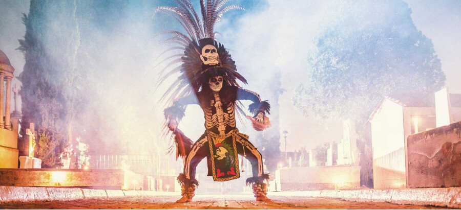
Padre azul
Spirit of Celebration: Transforming Padre azul
Padre azul is a dynamic, premium tequila start-up, inspired by a passion for Mexican culture. With roots in Mexico and Austria, this rapidly growing brand aims to make a fiery presence in the European and American markets.
Despite winning many awards for taste and quality, Padre azul was not well-positioned in the market. The dark and smoky advertising aesthetic didn't reflect the flamboyance, joy, and tradition the brand was proud of. While it was a great product with huge potential, its image lacked a consistent message and its visual representation was not on point.
We created a consistent visual message in line with the brand’s core values. This led to greater market recognition, making it easier for their team to identify key selling points and celebrate what makes their brand special.
Employees and clients are delighted to be part of the Padre azul family, highly satisfied with their experience.
The Goal
The company aimed to educate customers about the production process, from picking the best land for growing agave to the meticulous hand-made stitches on the bottle’s leather jacket.
Delivering curious insights into Mexican culture and providing a spiritual connection to the brand were part of the brief, along with building a new Padre community focused on celebrating together, not just selling tequila. It was also crucial to break the macho, heavy-spirit stereotype associated with tequila and make it more synonymous with fun and freedom, particularly appealing to women.
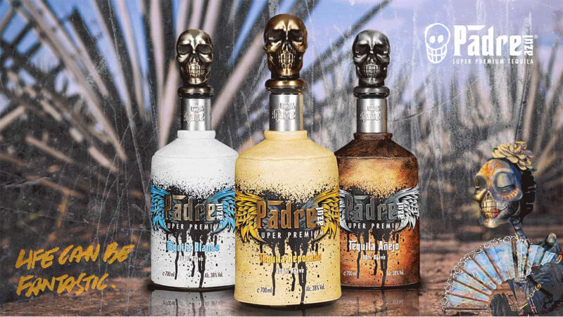
Strategy & Positioning
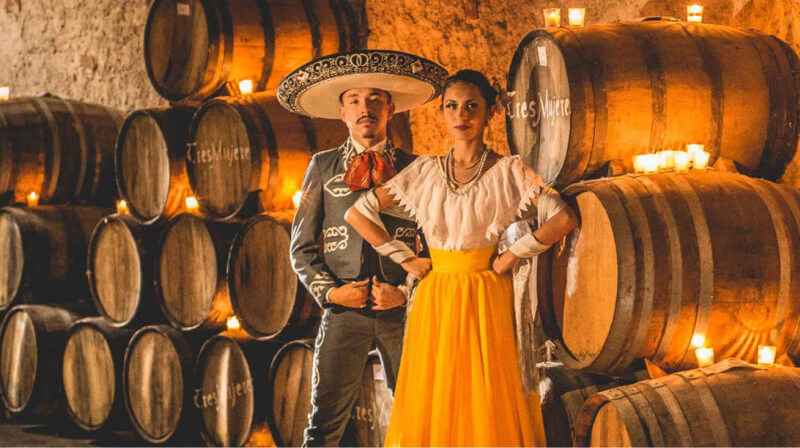
We needed to showcase the joy, beauty, and colors of Mexico, and the human connections these elements inspire. It was vital to correlate the features of the tequila and the bottle—the skull, the leather jacket, and the agave plant—with their cultural roots. The focus was on making Padre azul a catalyst for happy moments and gatherings among family and friends. The message also had to maintain the tequila’s reputation as a high-quality, award-winning product with every detail considered.
We aimed to remind customers that the smooth taste came from the best distillation methods and invite them to join the Padre azul family by sharing their photos and stories.
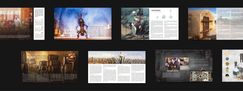
Brand Identity
We brought the brand to life with vibrant full-color photography set against black-and-white base elements to make the images pop, channeling a sense of mystique. We told the history of Padre azul, showcased the medals the tequila had won, and emphasized the core values of 100% Agave and 100% Mexico. To lighten the mood, we introduced Ramon as a friendly brand mascot and included similarly friendly iconography.
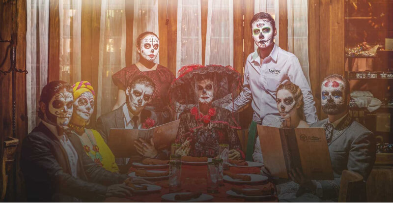
Promotional Materials
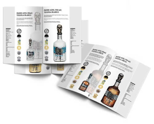
Clean sales brochures were created to support the sales department, along with a brand manifesto to help alcohol boutiques provide inspiring information about Padre azul. Curated photo walls for events like the Prague Hurley Days encouraged customers to crystallize their memories from a dream motor-trip to Tequila City.

Web design
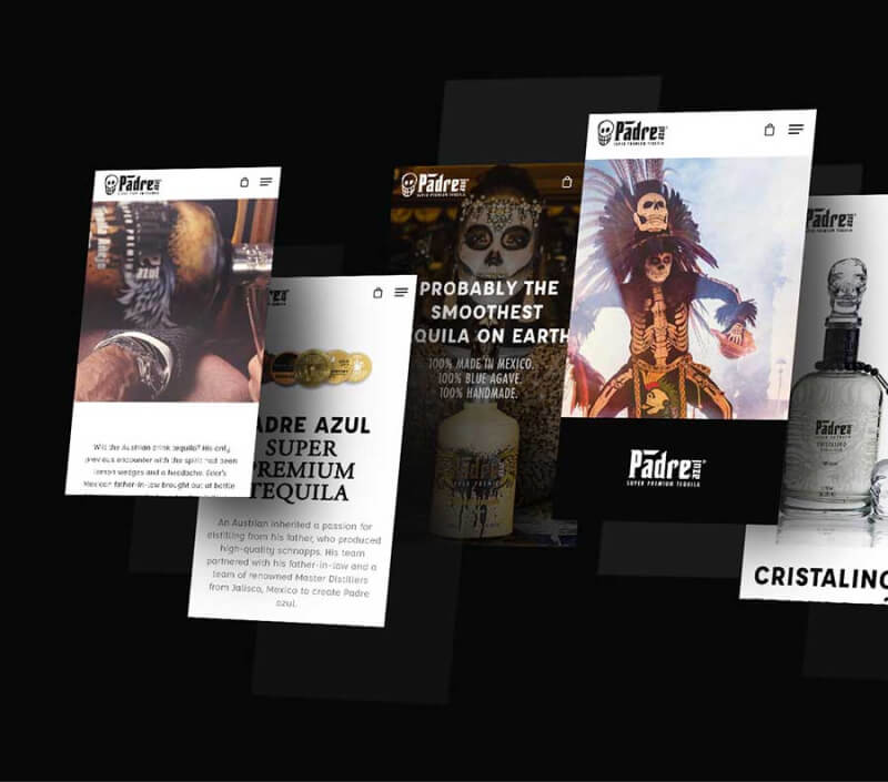
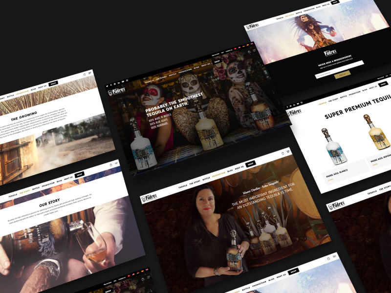
New website serves as an immersive platform that effectively showcases the brand's premium tequila offerings, highlighting their quality and production processes.
It also shares inspiring stories about Mexican culture, traditions, and celebratory customs. Through engaging content, the website invites visitors to explore the rich heritage behind Padre azul, fostering a deeper connection to the brand beyond just its products.
