Shiftly
Redefining Hospitality Recruitment: The Shiftly Journey
Dynamic start-up bridging the gap in the Polish hospitality job market. It connects recruiters with employees, helping both find their ideal shifts in the hospitality industry.
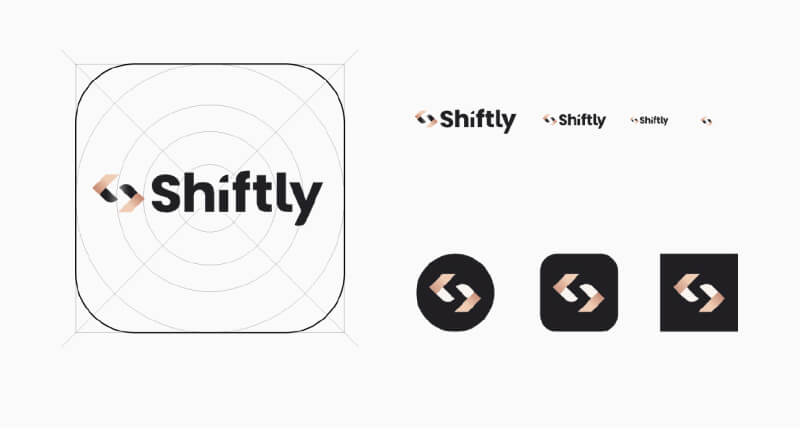
Shiftly needed a strong and appealing visual identity to establish itself as a high-end, trustworthy platform in a competitive market.
The challenge was to create a brand that was both luxurious and accessible, inspiring trust and admiration while being user-friendly for both experienced professionals and newcomers.
We successfully introduced strong, representative branding for Shiftly, positioning it effectively in the Polish HR market. Although the app is still in testing and development, making it hard to measure results, working on this project was immensely rewarding.
The Goal
We aimed to create a clean, high-quality visual identity for Shiftly, presenting it as a strong, charismatic, high-end platform. Shiftly builds relationships through kindness, modesty, a friendly approach, and hard work, guiding users towards aspirational jobs. It aspires to be a trustworthy go-to place for hospitality workers and recruiters, characterized by quality, class, and a sense of belonging and security.

Strategy & Positioning
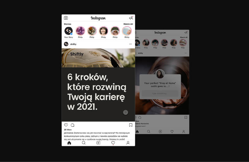
After defining key personas, we realized our users valued ease of use, comprehensiveness, and a touch of luxury. We embraced the brand archetypes of the everyman and the ruler to provide structure and foster connection. Guided by the words refined and friendly, we shaped Shiftly’s personality as an experienced guide—trustworthy, inspiring, yet accessible to newcomers.
UX/ UI Design
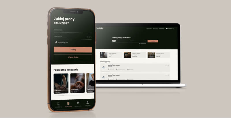
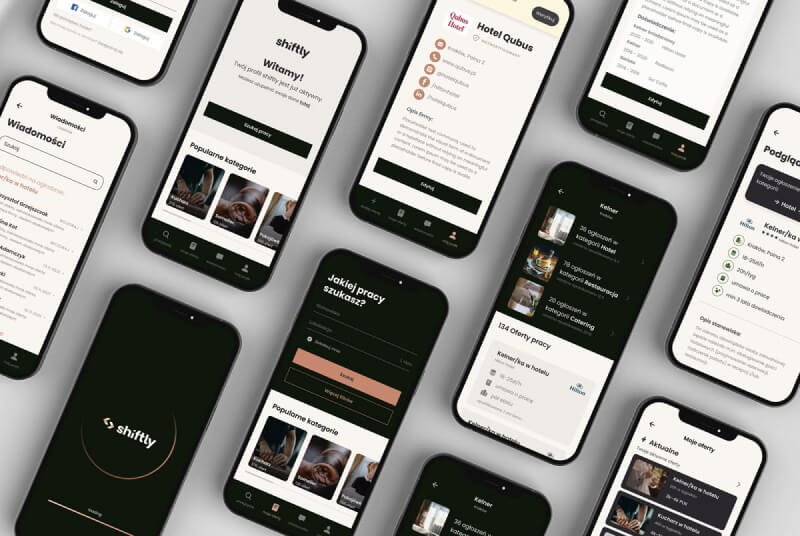
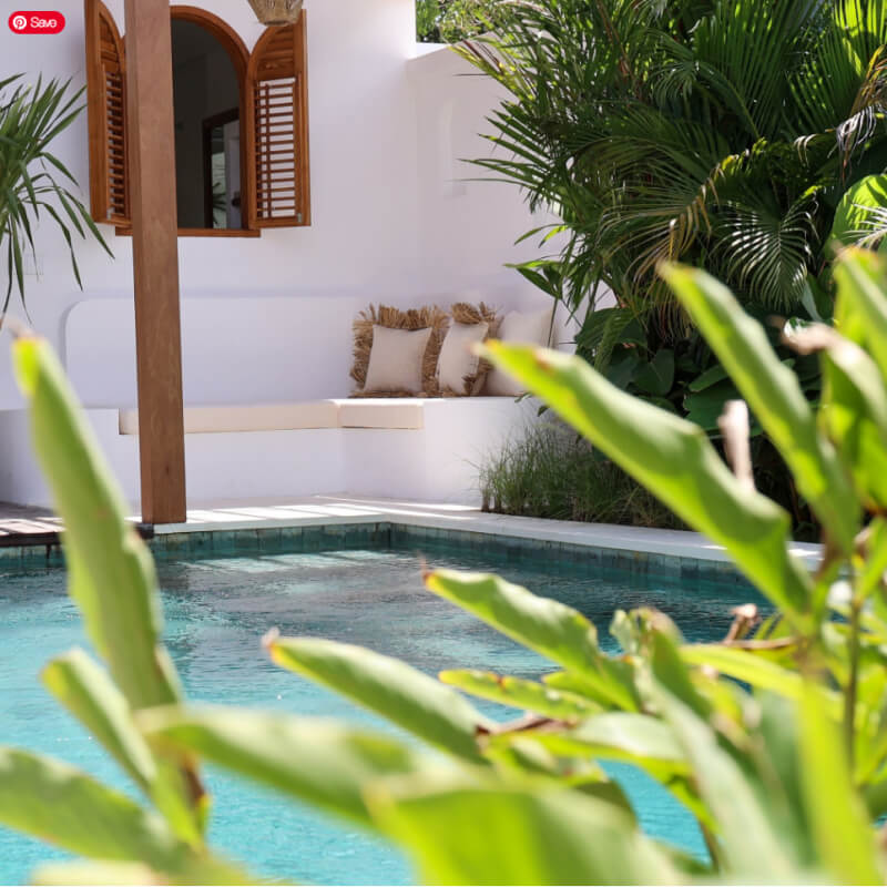
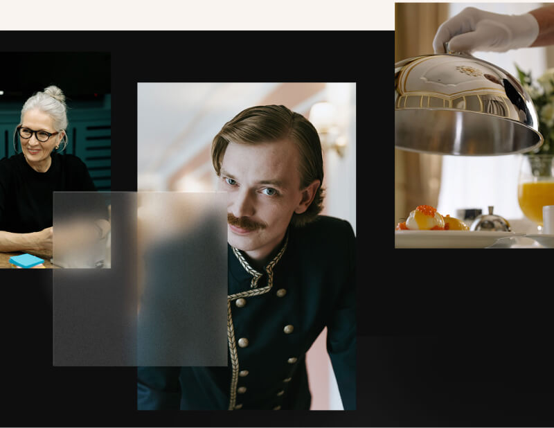
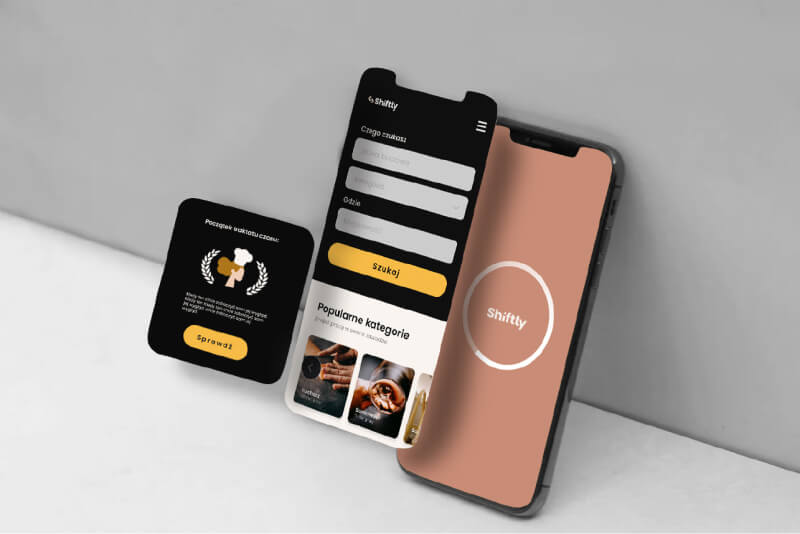
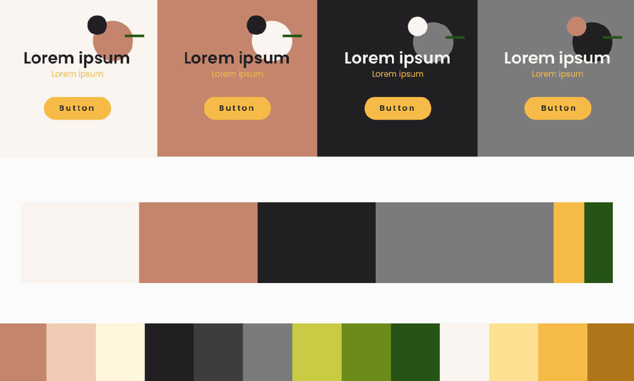
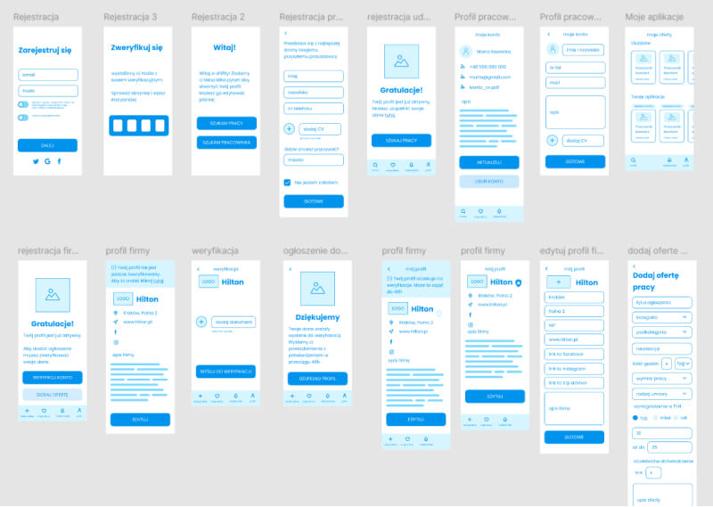
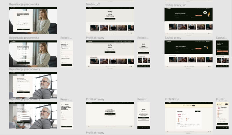
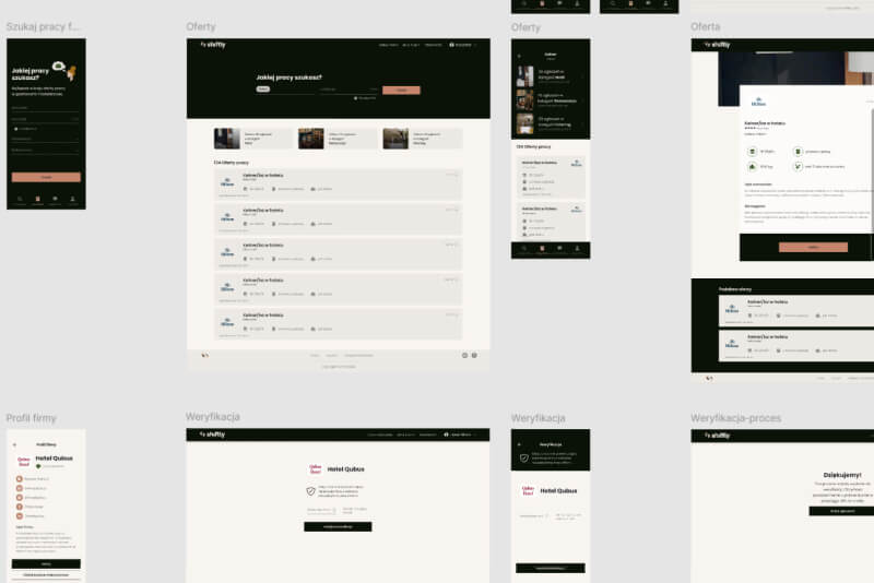
Our design approach featured toned colors, flat illustrations, and carefully selected photography. We ensured the app interfaces and overall visual impression were simple yet sophisticated, avoiding a cheap look.
